What's new in version 1.12?
In this update, we have released exciting new features, including Marketing Badges that provide coaches and agencies with a unique opportunity to build trust in marketing. We have also integrated long-awaited optimizations and functions into our popular submission feature.
Additionally, numerous improvements have been made to the editor, design, and performance of LearningSuite.
Overview of Changes:
New Features:
- Marketing Badges
- Text Submissions 2.0
- Fullscreen Review for Video Submissions
- Internal Notes for Submission Comments
- User Pop-Ups can be opened anywhere
- numerous other improvements
Improvements in the Editor:
- Element Search in the Editor
- Indentable Bullet Points
- New Element: Sorting Task
- New Element: Hub Linking
- Copy Function for Elements
- 3 new integrations for forms
- Style Settings for Image Elements
- Improved Order of Elements
- Design Improvements for Some Elements
Marketing Badges
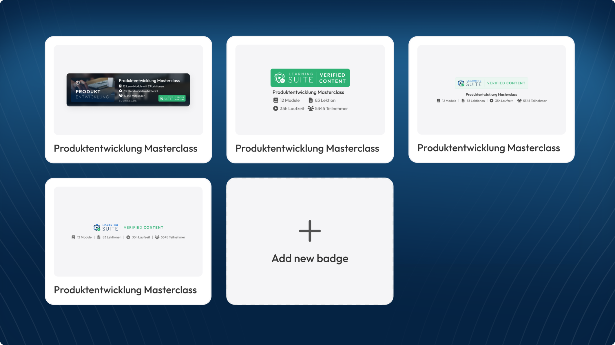
You can place the marketing badges on your website landing pages to demonstrate the comprehensive quality of your courses to your prospects.
These badges are fully verified by us.
With a click on the LearningSuite badge, an official LearningSuite website opens, listing all key figures about your course as well as company information.
This is a completely new and unique way to build trust with your target audience.
The marketing badges are perfect for the following purposes:
- Confirming the scope of your online course to your prospects.
- Displaying the scope of your internal employee training on the careers page.
- Officially confirming the content of the course in course lead magnets.
Text-Abgaben 2.0
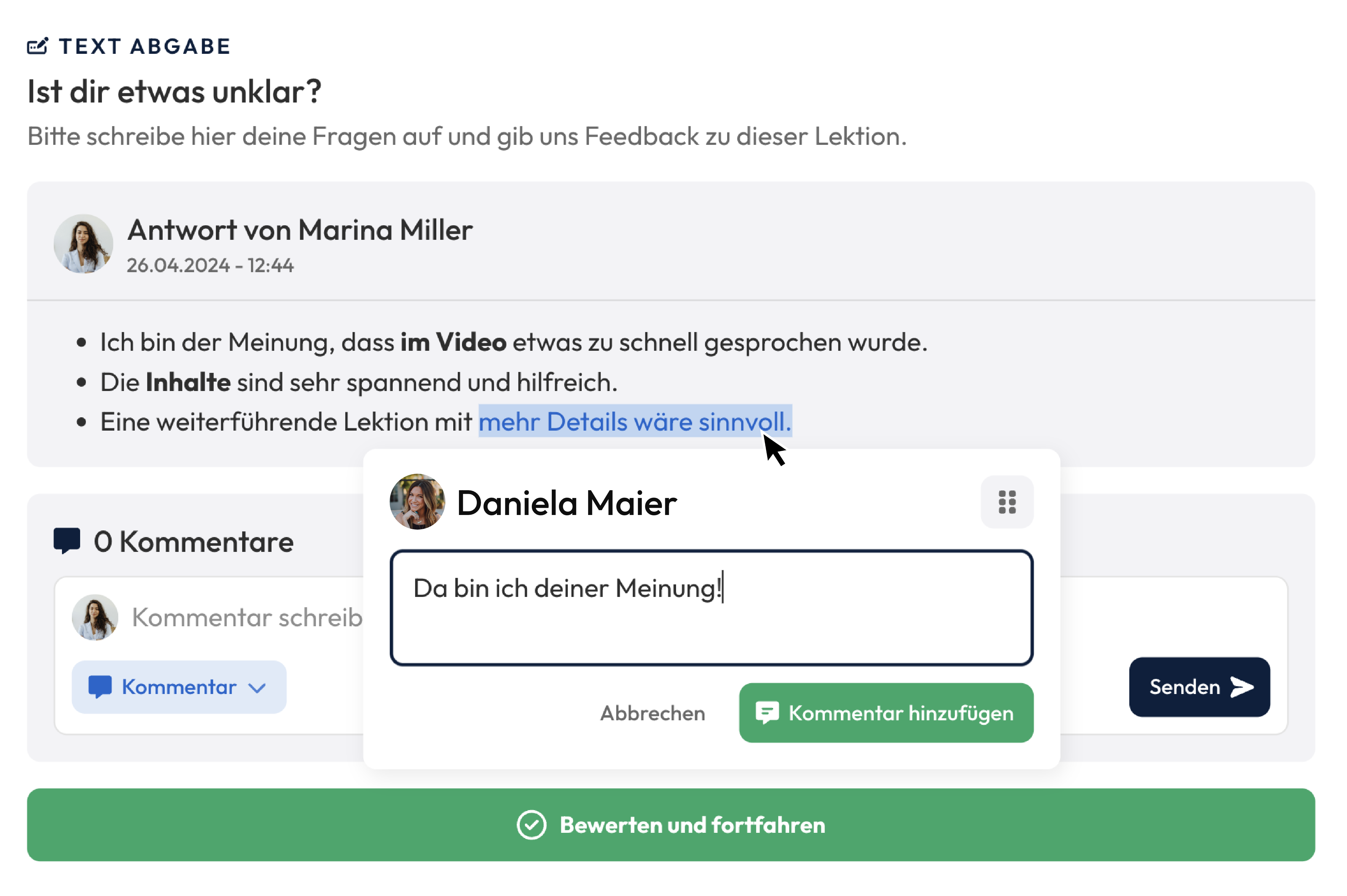
Rich text submission now possible:
It is now possible to write rich text. What does that mean? Members can send you formatted text, including headings, bullet points, and other formatting options. This allows you to use text submissions for more complex use cases – theoretically, you could even model a German school assignment with it.
Improved comment mechanism:
You can now comment on individual text passages, similar to Google Docs. To do this, as a trainer, simply mark the desired passage in the submission and then press the comment button. This way, you can give precise feedback and show members exactly where there is room for improvement.
Video Submission: Fullscreen-Review
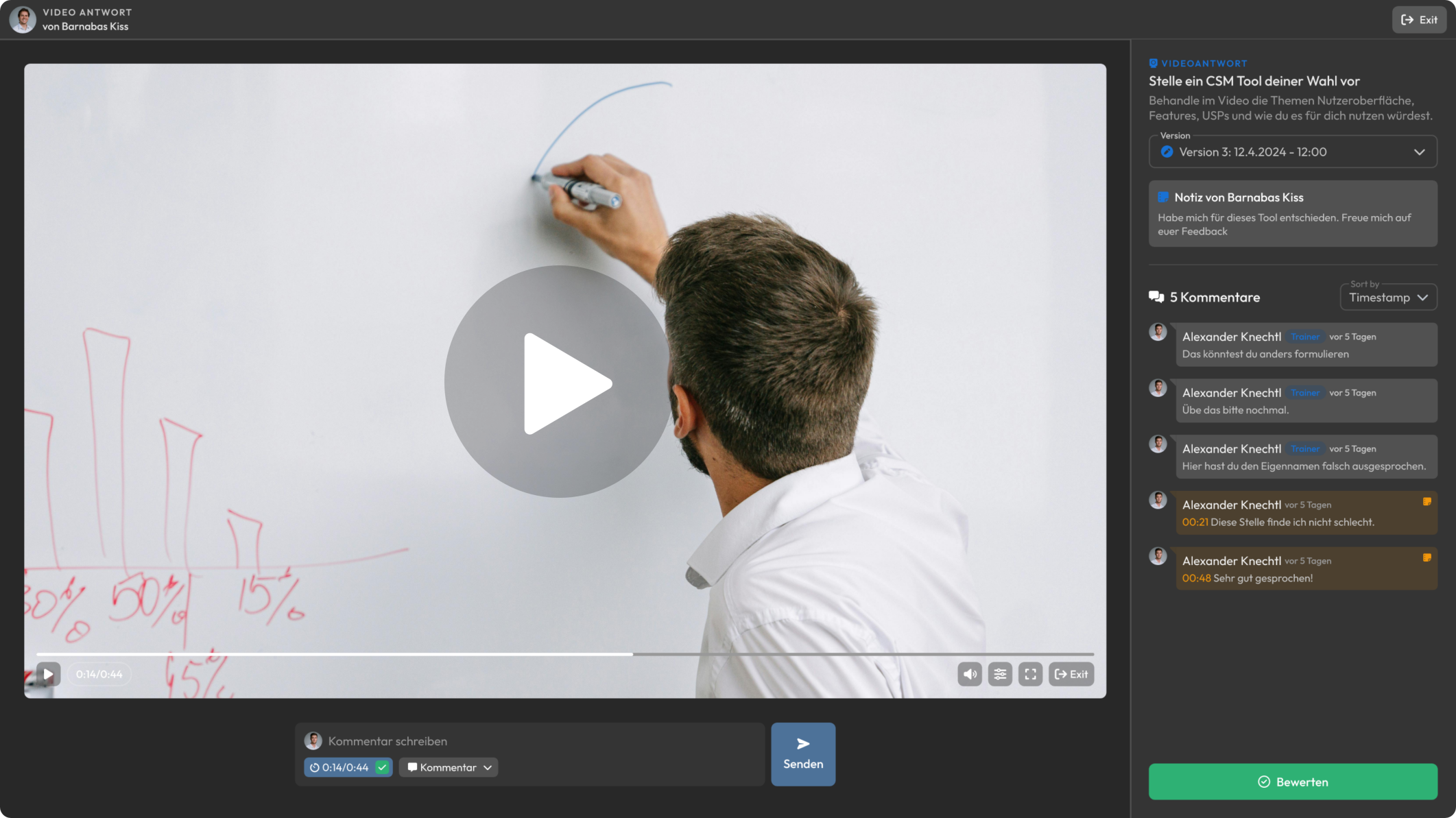
There's also a major new feature for video submissions to make evaluating and commenting on videos even easier. You can now open the full-screen mode for submitted videos. This opens our new video evaluation popup, where you can watch the video at maximum size and still send precise, time-stamped comments.
To ensure no information is missing, the task name, description, and the member's added note are displayed in the top right corner. With this feature, we aim to further improve the trainer experience, enabling them to give the best possible feedback to members.
Further improvements in submissions:
The comment mechanism has also received some enhancements. Firstly, the text field has been given a design update, and we have also added a new feature:
Internal Notes
With internal notes, you can write comments that only trainers can see. This allows you to document important information, such as observations about the member, to better address the individual needs and abilities of the learners.

Comments on File Submissions
It is now also possible to comment on individual files in file submissions. So, if you make a submission where five images need to be uploaded, you can now address and comment on each individual image.
Further Improvements
Links can now be used in comments as well as in additional explanations from members. These links will be visually highlighted.
User Popups can be opened anywhere
It's often important to access user information at specific moments, such as when reviewing a submission or looking at a person's statistics in a course.
To address this, you can now click on any user avatar name to open the user pop-up directly from there.
Element Search in the Editor
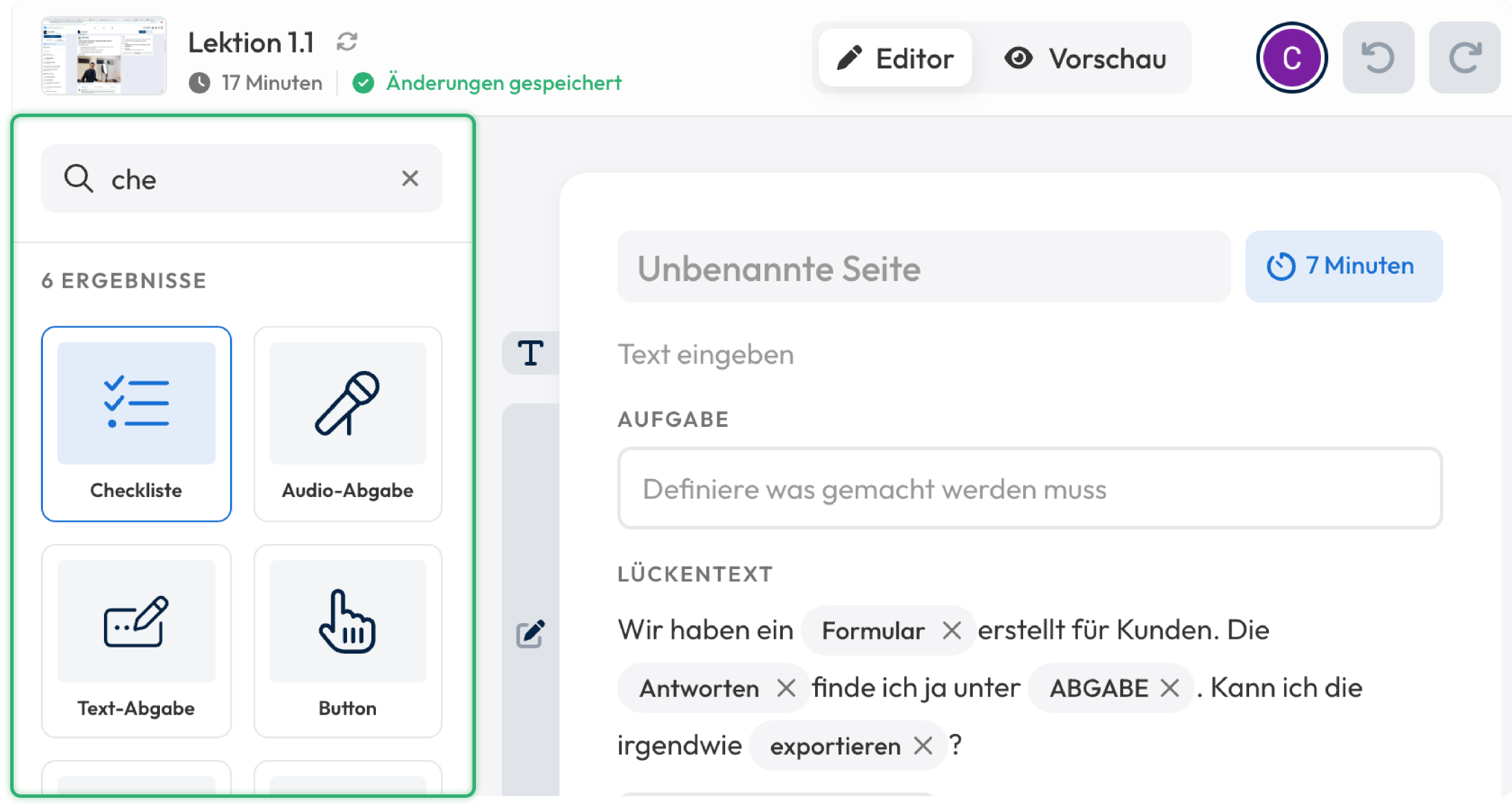
At the top of the left sidebar in the editor, you will now find the element search feature. This allows you to quickly and easily find content.
Here are some tips on how to make the most of the search function:
- Press Ctrl+K (on Windows) or ⌘+K (on MacOS) to instantly open the search at any time.
- Once a search term is entered, you can use Tab or the arrow keys to navigate between the found elements.
- To insert an element, you can use the familiar drag-and-drop method or simply press Enter to immediately insert it at your current working position.
Feel free to try out the search function. Once you get used to it, content creation becomes significantly faster!
New Element: Sort Task
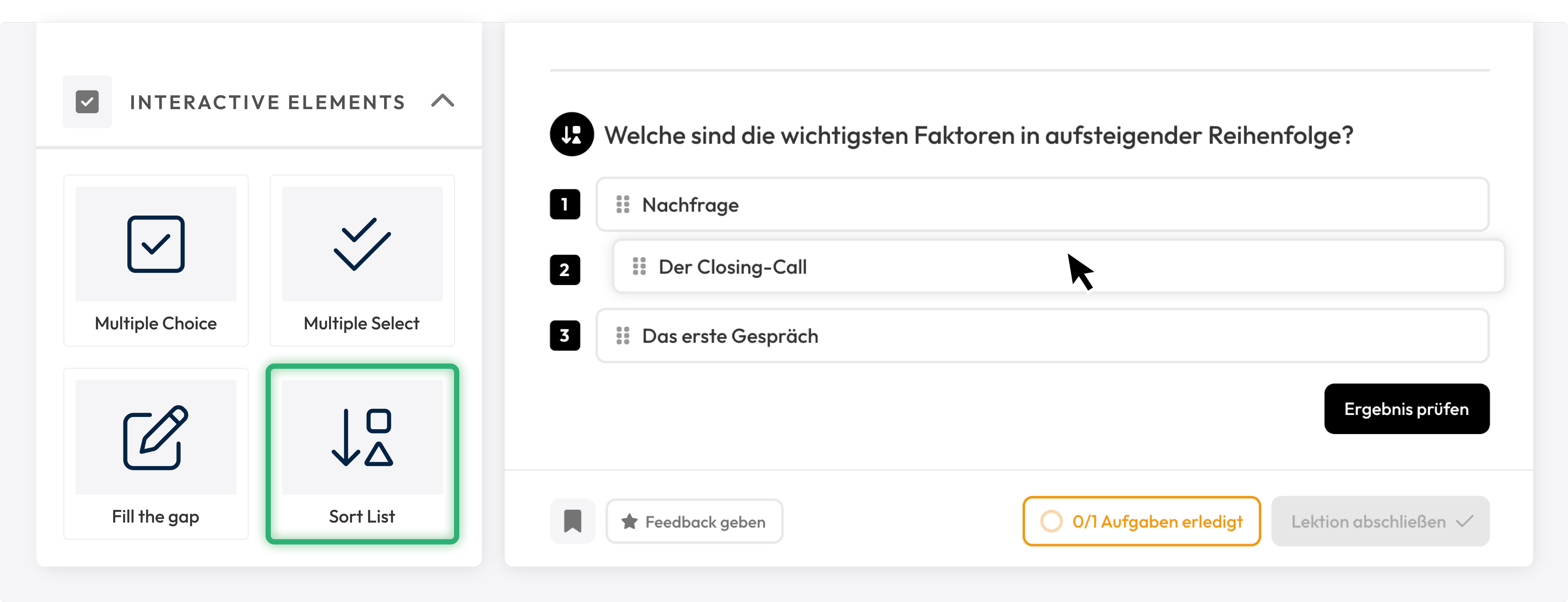
With the new interactive element, the sorting task, you can better assess whether your members have truly understood the conveyed knowledge. In this element, members must drag and drop items into the correct order.
New Element: Hub Linking
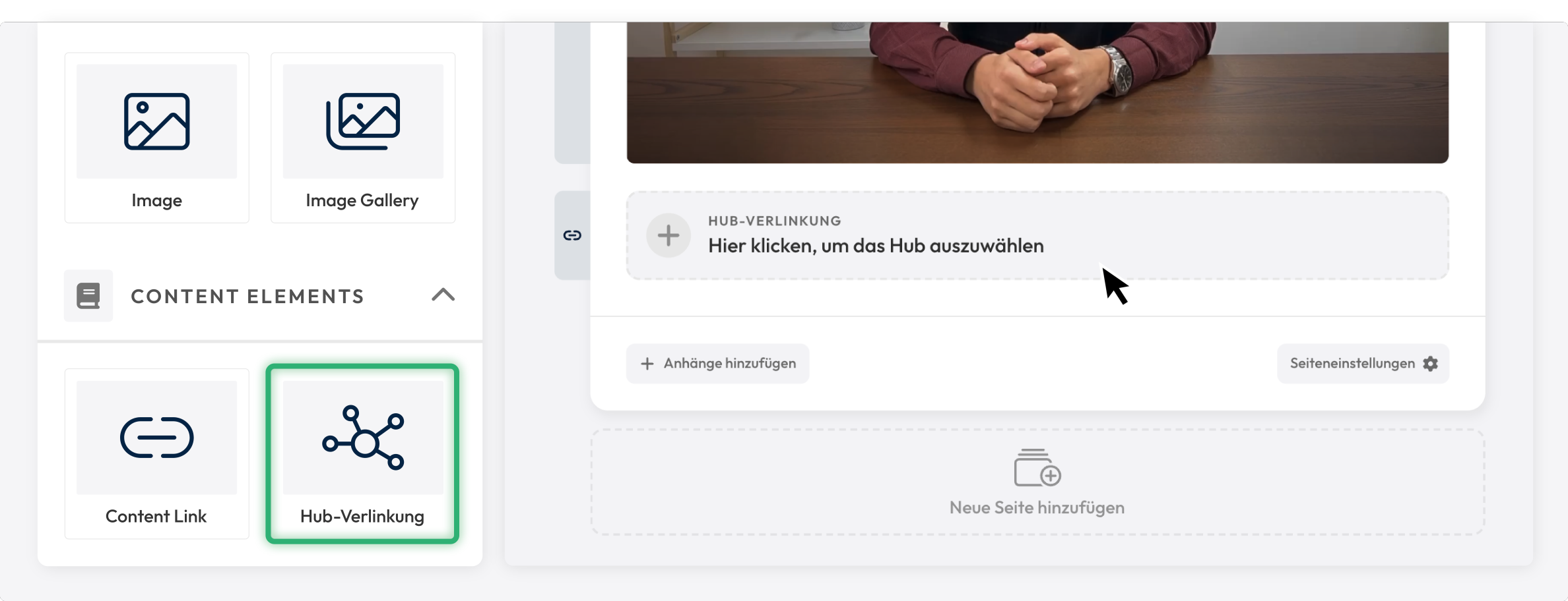
With Hub Linking, you now have the ability to link Hubs directly from the editor, just like with content linking.
Style Settings for Images
In the editor, you now have the ability to make various style adjustments to images. You can disable the fullscreen button or toggle the outer border on and off.
Additionally, for illustrations such as SVG files or PNG files with transparent backgrounds, you can adjust the background color.
Further Improvements:
- When modules appear in multiple courses, this is now displayed in the global search.
- The code editor for custom code has been redesigned.
- The dark mode has been optimized and improved in several areas.
- Submission elements now trigger the style panel no matter where you click within the submission.
- In the settings under "My LearningSuite," you can now activate the LearningSuite badge, which will be displayed to members in the lower left corner of the sidebar.
- Transcripts for videos can now be regenerated if the AI made an error in speech recognition.
- For videos in the editor, there is now an option to fix the playback speed.
- Major performance update for submissions: they now load in just a few milliseconds, even with hundreds of thousands of entries.
- Bullet point lists can now be indented up to 9 levels.
- Numerous bug fixes and optimizations.
We welcome your feedback, which you can send to us in our Facebook community or via chat in the HelpCenter.
Your LearningSuite Team!


.jpg)


